Before our senses of smell and taste can even begin to appreciate the quality of the wine in our glass, another, rather unexpected source of attraction has already caught the wine lover’s attention: something that appeals to the eye. We are talking about the visual identity of a bottle, the image that accompanies the experience of tasting, playing a secondary role, certainly, but one that over time becomes an essential symbol of belonging and distinction.
The label is a central feature of winemaking across the world, shared by every level of production, from industrial to artisanal. It offers a fresh and surprising perspective on the history of winemaking.
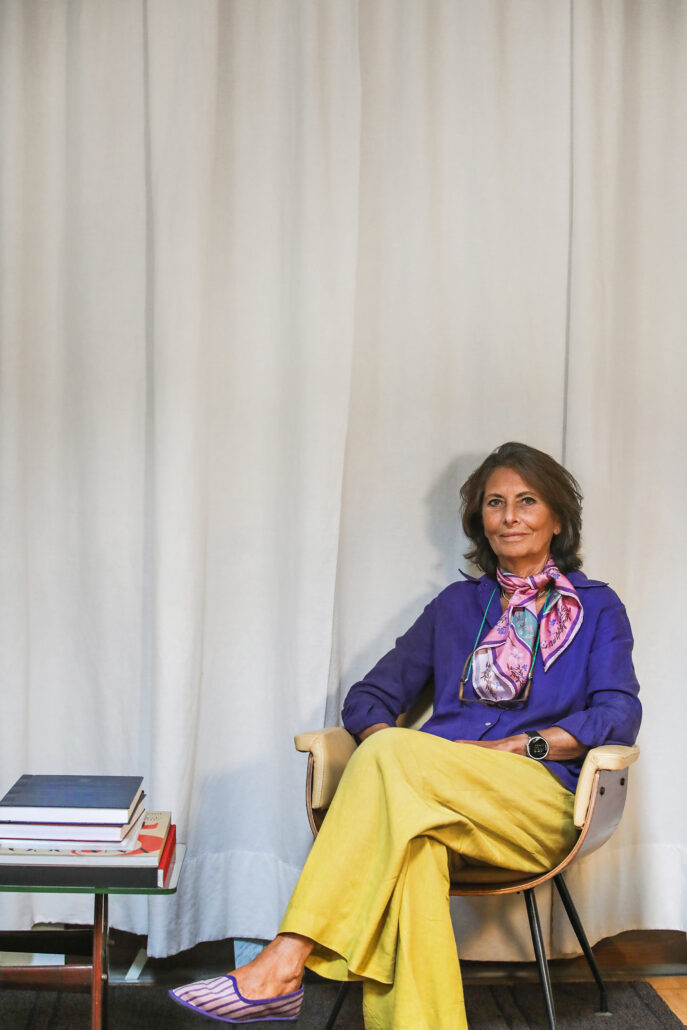
A vantage point where countless stories of winemaking intertwine with the art of design and the subtleties of marketing, creating a complex field that calls for an interdisciplinary approach. To explore the art of wine label design in all its dimensions, we met Simonetta Doni at her studio near Santa Maria Novella, in the heart of Florence. A graphic design expert and founder of Doni & Associati, she has devoted much of her career since the late 1970s to dressing Italian wines, alongside projects in publishing, exhibition catalogues and design.
The corridor leading to the studio’s offices resembles a wine shop, its walls lined with an endless array of bottles, each one the result of relationships built over more than 30 years in the business.
SD: Wine label design in Italy developed alongside a growing awareness among producers of the need to communicate. If I had to pinpoint a year when wineries first began exploring their brand identity and experimenting with label design, it would be 1986, the year of the methanol wine scandal.
Log in or subscribe.